Bold and Colorful Outdoor Furniture Ideas
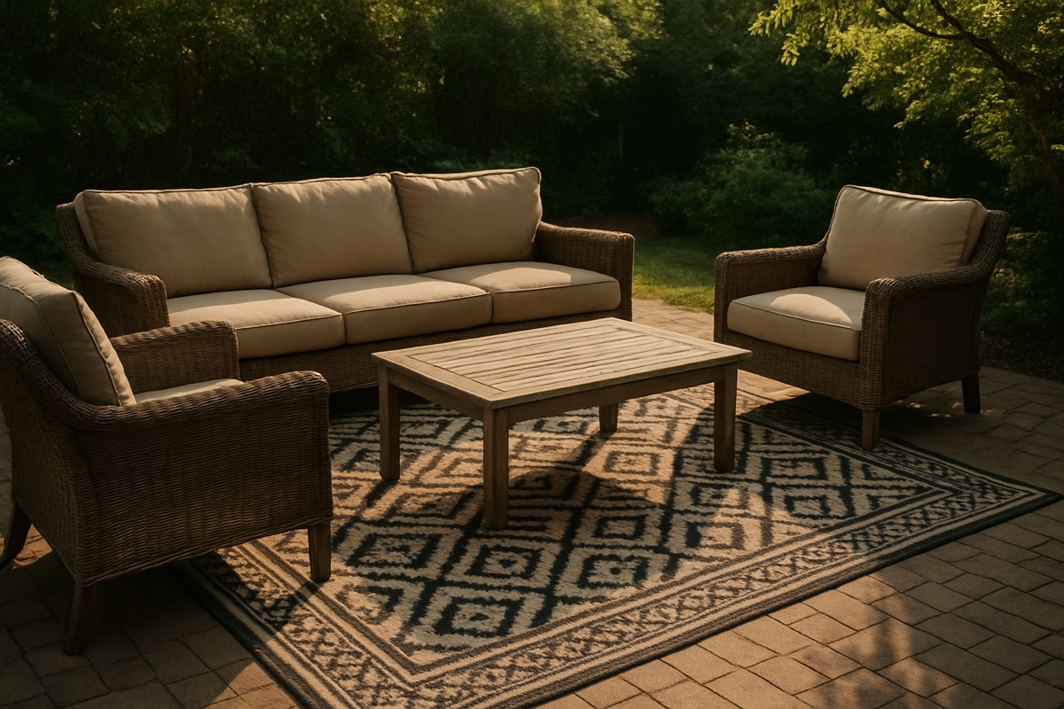
For years, the outdoor furniture world has been dominated by safe, neutral tones. Beige cushions, brown frames, gray wicker. There is nothing wrong with neutrals. They are versatile and timeless. But if your outdoor space feels a little bland, a little forgettable, maybe it is time to inject some personality. Bold and colorful outdoor furniture can transform your patio from a generic backyard setup into a space that genuinely reflects who you are and how you want to live.
The trend toward bolder outdoor spaces has been building for several years, and in 2026, it is in full swing. More homeowners are treating their patios like an extension of their interior design, complete with intentional color stories, statement pieces, and curated accessories. If you have been playing it safe, here is your guide to going bold, the right way.
Why Bold Color Works Outdoors
There is a reason colorful outdoor furniture has become increasingly popular. Natural outdoor settings, the green of your lawn, the blue of the sky, the earthy tones of mulch and stone, provide a neutral backdrop that can absorb bold colors without feeling overwhelming. A cobalt blue chair that might feel aggressive in a small living room looks perfectly balanced surrounded by green landscaping.
Color also creates mood. Warm tones like coral, terracotta, and golden yellow evoke energy and vibrancy. Cool tones like teal, navy, and sage create calm and sophistication. The right palette can make your outdoor space feel like a vacation destination or a peaceful retreat, depending on what you choose.
Color Trends for 2026 Outdoor Spaces
Earthy Brights
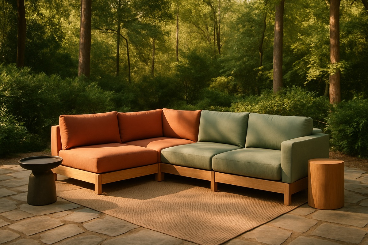
The biggest trend for 2026 is what designers are calling “earthy brights,” saturated colors drawn from nature but dialed up a notch. Think terracotta that leans toward burnt orange, sage green that pushes into emerald, and dusty blue that deepens into sapphire. These colors feel grounded because they reference natural tones, but they are vivid enough to make a statement.
Sunset Palettes
Inspired by the golden-hour hues of a Carolina sunset, this palette blends coral, peach, warm gold, and soft pink. It is inherently warm and welcoming, making it ideal for spaces designed for evening entertaining. Pair sunset-toned cushions with natural wood or warm-toned metal frames for a cohesive look.
Jewel Tones
Deep emerald, rich plum, sapphire blue, and garnet red bring a luxurious, dramatic feel to outdoor spaces. Jewel tones pair exceptionally well with dark-finished frames in charcoal, black, or espresso. This palette works particularly well in shaded or covered patios where the deeper colors will not be washed out by direct sunlight.
High-Contrast Black and Color
Black frames paired with a single bold accent color create a striking, modern look. A black aluminum dining set with vibrant citron-green cushions, or a black wicker sofa with deep turquoise pillows, makes a statement that is clean and contemporary. The black grounds the design while the color pops against it.
How to Add Color to Your Outdoor Space
Start with Cushions and Pillows
The lowest-risk way to add color is through cushions and throw pillows. If your furniture frames are neutral, swapping cushions lets you experiment with bold color without a permanent commitment. Sunbrella fabrics come in hundreds of vibrant colors and patterns that resist fading, so your bold choice stays bold season after season. Our custom outdoor cushions guide walks you through the process of selecting the perfect fabric and fill.
Choose a Colorful Frame
For a bolder statement, look for furniture with colored frames. Poly lumber furniture is one of the best options for this because the color runs all the way through the material and never needs painting or staining. Poly lumber Adirondack chairs in cherry red, aruba blue, or lime green are instantly eye-catching and virtually maintenance-free.
Powder-coated aluminum is another option, available in custom colors from many manufacturers. A dining set in matte navy or forest green adds color through the frame itself, allowing you to keep cushion colors neutral or complementary.
Accessories as Color Accents
If you are not ready to commit to a colorful furniture set, use accessories to introduce pops of color. Brightly colored planters, outdoor rugs, lanterns, and serving trays all contribute to the palette without requiring a major investment. The advantage of this approach is flexibility. You can change your accent colors seasonally or whenever you feel like refreshing the look.
Rules for Mixing Colors Successfully
Going bold does not mean going chaotic. A few guiding principles keep colorful spaces looking intentional rather than random.
Stick to a palette of two to three main colors plus a neutral. This gives you variety without visual overload. Use the 60-30-10 rule borrowed from interior design. Sixty percent of your space should be your dominant color, often a neutral or subtle tone. Thirty percent should be your secondary color, a bolder hue that adds interest. Ten percent should be your accent, the most vibrant or contrasting color that draws the eye.
Consider your home’s exterior. Your patio furniture should complement, not clash with, your siding, brick, or stone. A warm-toned brick home pairs naturally with warm furniture colors, while a cool gray exterior works well with blues and greens.
Do not forget about your landscaping. If you have beds of red azaleas, purple cushions might compete visually. Work with your existing garden colors rather than against them.
Bold Color in the Carolina Context
Charlotte-area homeowners have a natural advantage when it comes to colorful outdoor furniture. Our lush, green landscapes from spring through fall provide the perfect neutral canvas for bold pieces. The warm, golden quality of Carolina sunlight also makes colors appear rich and inviting rather than harsh.
That said, our intense summer sun is a factor. If your furniture sits in full sun all day, choose fabrics and materials specifically rated for UV resistance. Sunbrella and poly lumber hold their color under direct sunlight far better than cheaper alternatives. There is nothing worse than a bold color choice that fades to a washed-out version of itself within a year.
Frequently Asked Questions
Will bold-colored outdoor furniture go out of style quickly?
Classic bold colors like navy, red, and forest green have been popular for decades and are unlikely to feel dated. Trendier colors like specific shades of coral or chartreuse may cycle in and out of fashion. If longevity concerns you, choose bold but classic hues for your major pieces and save trendier colors for cushions and accessories that are easy and affordable to swap out.
How do I keep colorful outdoor fabrics from fading?
Choose solution-dyed acrylic fabrics like Sunbrella, which are engineered to resist UV fading for years. Adding shade through an umbrella, pergola, or shade sail further protects colors. Regular cleaning also helps because built-up dirt and pollen can dull the appearance of even the most fade-resistant fabrics.
Can I mix patterns and solid colors in my outdoor space?
Absolutely. Mixing patterns with solids is one of the best ways to create a dynamic, layered look. The key is to connect them through a shared color. For example, if your seat cushions are a solid teal, choose throw pillows in a pattern that includes teal along with one or two accent colors. Vary the scale of patterns as well, pairing a large-scale stripe with a small-scale geometric, for example.
Ready to add some personality to your outdoor space? Carolina Patio Furniture carries a wide range of colorful collections in poly lumber, wicker, aluminum, and more, along with hundreds of Sunbrella fabric options to create the exact look you envision. Contact us today to explore your options and get a personalized quote for a patio that is anything but boring.